Dynamic Tweet Maps
In this notebook we are going to make some maps depicting when and where tweets are sent.
We will also use the sentiment classes from the previous notebooks to illustrate which type of tweets are frequent at different times in different countries.
Dependencies:
In order to run this notebook you need to install some dependencies, via apt, pip and git. To install the dependencies run the following three cells (it might take a few minutes).
(We have used the cluster "small-2-8Ws-class-01-sp3-sc2-12" for our experiments.)
sudo apt-get -y install libproj-dev
sudo apt-get -y install libgeos++-dev
Reading package lists...
Building dependency tree...
Reading state information...
libproj-dev is already the newest version (4.9.3-2).
The following packages were automatically installed and are no longer required:
  libcap2-bin libpam-cap zulu-repo
Use 'sudo apt autoremove' to remove them.
0 upgraded, 0 newly installed, 0 to remove and 17 not upgraded.
Reading package lists...
Building dependency tree...
Reading state information...
libgeos++-dev is already the newest version (3.6.2-1build2).
The following packages were automatically installed and are no longer required:
  libcap2-bin libpam-cap zulu-repo
Use 'sudo apt autoremove' to remove them.
0 upgraded, 0 newly installed, 0 to remove and 17 not upgraded.
%pip install plotly
%pip install pycountry
%pip install geopandas
%pip install geoplot
%pip install imageio
Python interpreter will be restarted.
Collecting plotly
  Downloading plotly-4.14.3-py2.py3-none-any.whl (13.2 MB)
Requirement already satisfied: six in /databricks/python3/lib/python3.7/site-packages (from plotly) (1.14.0)
Collecting retrying>=1.3.3
  Downloading retrying-1.3.3.tar.gz (10 kB)
Building wheels for collected packages: retrying
  Building wheel for retrying (setup.py): started
  Building wheel for retrying (setup.py): finished with status 'done'
  Created wheel for retrying: filename=retrying-1.3.3-py3-none-any.whl size=11430 sha256=d44981ab5b644b464561fdd8ffbda5b3b476a52efe985dab72bd1549d6a6d1f0
  Stored in directory: /root/.cache/pip/wheels/f9/8d/8d/f6af3f7f9eea3553bc2fe6d53e4b287dad18b06a861ac56ddf
Successfully built retrying
Installing collected packages: retrying, plotly
Successfully installed plotly-4.14.3 retrying-1.3.3
Python interpreter will be restarted.
Python interpreter will be restarted.
Collecting pycountry
  Downloading pycountry-20.7.3.tar.gz (10.1 MB)
Building wheels for collected packages: pycountry
  Building wheel for pycountry (setup.py): started
  Building wheel for pycountry (setup.py): finished with status 'done'
  Created wheel for pycountry: filename=pycountry-20.7.3-py2.py3-none-any.whl size=10746863 sha256=2b60c51268a303df86bea421d372ba1ed4001f8ffa211a0d9e98601fa0ab1ed5
  Stored in directory: /root/.cache/pip/wheels/57/e8/3f/120ccc1ff7541c108bc5d656e2a14c39da0d824653b62284c6
Successfully built pycountry
Installing collected packages: pycountry
Successfully installed pycountry-20.7.3
Python interpreter will be restarted.
Python interpreter will be restarted.
Collecting geopandas
  Downloading geopandas-0.8.2-py2.py3-none-any.whl (962 kB)
Requirement already satisfied: pandas>=0.23.0 in /databricks/python3/lib/python3.7/site-packages (from geopandas) (1.0.1)
Collecting pyproj>=2.2.0
  Downloading pyproj-3.0.0.post1-cp37-cp37m-manylinux2010_x86_64.whl (6.4 MB)
Collecting fiona
  Downloading Fiona-1.8.18-cp37-cp37m-manylinux1_x86_64.whl (14.8 MB)
Collecting shapely
  Downloading Shapely-1.7.1-cp37-cp37m-manylinux1_x86_64.whl (1.0 MB)
Requirement already satisfied: python-dateutil>=2.6.1 in /databricks/python3/lib/python3.7/site-packages (from pandas>=0.23.0->geopandas) (2.8.1)
Requirement already satisfied: numpy>=1.13.3 in /databricks/python3/lib/python3.7/site-packages (from pandas>=0.23.0->geopandas) (1.18.1)
Requirement already satisfied: pytz>=2017.2 in /databricks/python3/lib/python3.7/site-packages (from pandas>=0.23.0->geopandas) (2019.3)
Requirement already satisfied: certifi in /databricks/python3/lib/python3.7/site-packages (from pyproj>=2.2.0->geopandas) (2020.6.20)
Requirement already satisfied: six>=1.5 in /databricks/python3/lib/python3.7/site-packages (from python-dateutil>=2.6.1->pandas>=0.23.0->geopandas) (1.14.0)
Collecting munch
  Downloading munch-2.5.0-py2.py3-none-any.whl (10 kB)
Collecting click-plugins>=1.0
  Downloading click_plugins-1.1.1-py2.py3-none-any.whl (7.5 kB)
Collecting attrs>=17
  Downloading attrs-20.3.0-py2.py3-none-any.whl (49 kB)
Collecting cligj>=0.5
  Downloading cligj-0.7.1-py3-none-any.whl (7.1 kB)
Collecting click<8,>=4.0
  Downloading click-7.1.2-py2.py3-none-any.whl (82 kB)
Installing collected packages: click, munch, cligj, click-plugins, attrs, shapely, pyproj, fiona, geopandas
Successfully installed attrs-20.3.0 click-7.1.2 click-plugins-1.1.1 cligj-0.7.1 fiona-1.8.18 geopandas-0.8.2 munch-2.5.0 pyproj-3.0.0.post1 shapely-1.7.1
Python interpreter will be restarted.
Python interpreter will be restarted.
Collecting geoplot
  Downloading geoplot-0.4.1-py3-none-any.whl (28 kB)
Requirement already satisfied: seaborn in /databricks/python3/lib/python3.7/site-packages (from geoplot) (0.10.0)
Requirement already satisfied: matplotlib in /databricks/python3/lib/python3.7/site-packages (from geoplot) (3.1.3)
Collecting mapclassify>=2.1
  Downloading mapclassify-2.4.2-py3-none-any.whl (38 kB)
Collecting contextily>=1.0.0
  Downloading contextily-1.0.1-py3-none-any.whl (23 kB)
Collecting cartopy
  Downloading Cartopy-0.18.0.tar.gz (14.4 MB)
Requirement already satisfied: pandas in /databricks/python3/lib/python3.7/site-packages (from geoplot) (1.0.1)
Requirement already satisfied: geopandas in /local_disk0/.ephemeral_nfs/envs/pythonEnv-318e9509-84da-4944-ac59-77216123051e/lib/python3.7/site-packages (from geoplot) (0.8.2)
Collecting descartes
  Downloading descartes-1.1.0-py3-none-any.whl (5.8 kB)
Collecting mercantile
  Downloading mercantile-1.1.6-py3-none-any.whl (13 kB)
Collecting pillow
  Downloading Pillow-8.1.0-cp37-cp37m-manylinux1_x86_64.whl (2.2 MB)
Collecting geopy
  Downloading geopy-2.1.0-py3-none-any.whl (112 kB)
Requirement already satisfied: joblib in /databricks/python3/lib/python3.7/site-packages (from contextily>=1.0.0->geoplot) (0.14.1)
Collecting rasterio
  Downloading rasterio-1.2.0-cp37-cp37m-manylinux1_x86_64.whl (19.1 MB)
Requirement already satisfied: requests in /databricks/python3/lib/python3.7/site-packages (from contextily>=1.0.0->geoplot) (2.22.0)
Requirement already satisfied: scipy>=1.0 in /databricks/python3/lib/python3.7/site-packages (from mapclassify>=2.1->geoplot) (1.4.1)
Requirement already satisfied: numpy>=1.3 in /databricks/python3/lib/python3.7/site-packages (from mapclassify>=2.1->geoplot) (1.18.1)
Requirement already satisfied: scikit-learn in /databricks/python3/lib/python3.7/site-packages (from mapclassify>=2.1->geoplot) (0.22.1)
Collecting networkx
  Downloading networkx-2.5-py3-none-any.whl (1.6 MB)
Requirement already satisfied: python-dateutil>=2.6.1 in /databricks/python3/lib/python3.7/site-packages (from pandas->geoplot) (2.8.1)
Requirement already satisfied: pytz>=2017.2 in /databricks/python3/lib/python3.7/site-packages (from pandas->geoplot) (2019.3)
Requirement already satisfied: six>=1.5 in /databricks/python3/lib/python3.7/site-packages (from python-dateutil>=2.6.1->pandas->geoplot) (1.14.0)
Requirement already satisfied: shapely>=1.5.6 in /local_disk0/.ephemeral_nfs/envs/pythonEnv-318e9509-84da-4944-ac59-77216123051e/lib/python3.7/site-packages (from cartopy->geoplot) (1.7.1)
Collecting pyshp>=1.1.4
  Downloading pyshp-2.1.3.tar.gz (219 kB)
Requirement already satisfied: setuptools>=0.7.2 in /usr/local/lib/python3.7/dist-packages (from cartopy->geoplot) (45.2.0)
Requirement already satisfied: pyproj>=2.2.0 in /local_disk0/.ephemeral_nfs/envs/pythonEnv-318e9509-84da-4944-ac59-77216123051e/lib/python3.7/site-packages (from geopandas->geoplot) (3.0.0.post1)
Requirement already satisfied: fiona in /local_disk0/.ephemeral_nfs/envs/pythonEnv-318e9509-84da-4944-ac59-77216123051e/lib/python3.7/site-packages (from geopandas->geoplot) (1.8.18)
Requirement already satisfied: certifi in /databricks/python3/lib/python3.7/site-packages (from pyproj>=2.2.0->geopandas->geoplot) (2020.6.20)
Requirement already satisfied: munch in /local_disk0/.ephemeral_nfs/envs/pythonEnv-318e9509-84da-4944-ac59-77216123051e/lib/python3.7/site-packages (from fiona->geopandas->geoplot) (2.5.0)
Requirement already satisfied: click-plugins>=1.0 in /local_disk0/.ephemeral_nfs/envs/pythonEnv-318e9509-84da-4944-ac59-77216123051e/lib/python3.7/site-packages (from fiona->geopandas->geoplot) (1.1.1)
Requirement already satisfied: attrs>=17 in /local_disk0/.ephemeral_nfs/envs/pythonEnv-318e9509-84da-4944-ac59-77216123051e/lib/python3.7/site-packages (from fiona->geopandas->geoplot) (20.3.0)
Requirement already satisfied: cligj>=0.5 in /local_disk0/.ephemeral_nfs/envs/pythonEnv-318e9509-84da-4944-ac59-77216123051e/lib/python3.7/site-packages (from fiona->geopandas->geoplot) (0.7.1)
Requirement already satisfied: click<8,>=4.0 in /local_disk0/.ephemeral_nfs/envs/pythonEnv-318e9509-84da-4944-ac59-77216123051e/lib/python3.7/site-packages (from fiona->geopandas->geoplot) (7.1.2)
Collecting geographiclib<2,>=1.49
  Downloading geographiclib-1.50-py3-none-any.whl (38 kB)
Requirement already satisfied: cycler>=0.10 in /databricks/python3/lib/python3.7/site-packages (from matplotlib->geoplot) (0.10.0)
Requirement already satisfied: pyparsing!=2.0.4,!=2.1.2,!=2.1.6,>=2.0.1 in /databricks/python3/lib/python3.7/site-packages (from matplotlib->geoplot) (2.4.6)
Requirement already satisfied: kiwisolver>=1.0.1 in /databricks/python3/lib/python3.7/site-packages (from matplotlib->geoplot) (1.1.0)
Requirement already satisfied: decorator>=4.3.0 in /databricks/python3/lib/python3.7/site-packages (from networkx->mapclassify>=2.1->geoplot) (4.4.1)
Collecting affine
  Downloading affine-2.3.0-py2.py3-none-any.whl (15 kB)
Collecting snuggs>=1.4.1
  Downloading snuggs-1.4.7-py3-none-any.whl (5.4 kB)
Requirement already satisfied: idna<2.9,>=2.5 in /databricks/python3/lib/python3.7/site-packages (from requests->contextily>=1.0.0->geoplot) (2.8)
Requirement already satisfied: urllib3!=1.25.0,!=1.25.1,<1.26,>=1.21.1 in /databricks/python3/lib/python3.7/site-packages (from requests->contextily>=1.0.0->geoplot) (1.25.8)
Requirement already satisfied: chardet<3.1.0,>=3.0.2 in /usr/lib/python3/dist-packages (from requests->contextily>=1.0.0->geoplot) (3.0.4)
Building wheels for collected packages: cartopy, pyshp
  Building wheel for cartopy (setup.py): started
  Building wheel for cartopy (setup.py): finished with status 'done'
  Created wheel for cartopy: filename=Cartopy-0.18.0-cp37-cp37m-linux_x86_64.whl size=15127828 sha256=a7843bd96a5753ca15c4c1952b65a93a5ae9378f67d5c17cf1398436b77dfb80
  Stored in directory: /root/.cache/pip/wheels/0b/a9/54/172056df34478378e0636d30cd4d1a868de00e37254649bf1a
  Building wheel for pyshp (setup.py): started
  Building wheel for pyshp (setup.py): finished with status 'done'
  Created wheel for pyshp: filename=pyshp-2.1.3-py3-none-any.whl size=37262 sha256=f31c01d2d2d597d89e643a155abbf55b7de6db2c096a5aa21a9d267d548ed9b3
  Stored in directory: /root/.cache/pip/wheels/43/f8/87/53c8cd41545ba20e536ea29a8fcb5431b5f477ca50d5dffbbe
Successfully built cartopy pyshp
Installing collected packages: snuggs, geographiclib, affine, rasterio, pyshp, pillow, networkx, mercantile, geopy, mapclassify, descartes, contextily, cartopy, geoplot
Successfully installed affine-2.3.0 cartopy-0.18.0 contextily-1.0.1 descartes-1.1.0 geographiclib-1.50 geoplot-0.4.1 geopy-2.1.0 mapclassify-2.4.2 mercantile-1.1.6 networkx-2.5 pillow-8.1.0 pyshp-2.1.3 rasterio-1.2.0 snuggs-1.4.7
Python interpreter will be restarted.
Python interpreter will be restarted.
Collecting imageio
  Downloading imageio-2.9.0-py3-none-any.whl (3.3 MB)
Requirement already satisfied: numpy in /databricks/python3/lib/python3.7/site-packages (from imageio) (1.18.1)
Requirement already satisfied: pillow in /local_disk0/.ephemeral_nfs/envs/pythonEnv-318e9509-84da-4944-ac59-77216123051e/lib/python3.7/site-packages (from imageio) (8.1.0)
Installing collected packages: imageio
Successfully installed imageio-2.9.0
Python interpreter will be restarted.
git clone https://github.com/mthh/cartogram_geopandas.git
cd cartogram_geopandas/
python setup.py install
Cloning into 'cartogram_geopandas'...
Compiling cycartogram.pyx because it changed.
[1/1] Cythonizing cycartogram.pyx
running install
running build
running build_py
creating build
creating build/lib.linux-x86_64-3.7
copying cartogram_geopandas.py -> build/lib.linux-x86_64-3.7
running build_ext
building 'cycartogram' extension
creating build/temp.linux-x86_64-3.7
x86_64-linux-gnu-gcc -pthread -Wno-unused-result -Wsign-compare -DNDEBUG -g -fwrapv -O2 -Wall -g -fstack-protector-strong -Wformat -Werror=format-security -g -fwrapv -O2 -g -fstack-protector-strong -Wformat -Werror=format-security -Wdate-time -D_FORTIFY_SOURCE=2 -fPIC -I/usr/include/python3.7m -I/local_disk0/.ephemeral_nfs/envs/pythonEnv-318e9509-84da-4944-ac59-77216123051e/include/python3.7m -c cycartogram.c -o build/temp.linux-x86_64-3.7/cycartogram.o
cycartogram.c: In function ‘__pyx_f_11cycartogram_transform_geom’:
cycartogram.c:2084:39: warning: comparison between signed and unsigned integer expressions [-Wsign-compare]
       for (__pyx_t_16 = 0; __pyx_t_16 < __pyx_t_15; __pyx_t_16+=1) {
                                       ^
cycartogram.c:2134:41: warning: comparison between signed and unsigned integer expressions [-Wsign-compare]
         for (__pyx_t_21 = 0; __pyx_t_21 < __pyx_t_20; __pyx_t_21+=1) {
                                         ^
cycartogram.c: In function ‘__pyx_pf_11cycartogram_9Cartogram_4cartogram’:
cycartogram.c:3835:37: warning: comparison between signed and unsigned integer expressions [-Wsign-compare]
     for (__pyx_t_13 = 0; __pyx_t_13 < __pyx_t_12; __pyx_t_13+=1) {
                                     ^
x86_64-linux-gnu-gcc -pthread -shared -Wl,-O1 -Wl,-Bsymbolic-functions -Wl,-Bsymbolic-functions -Wl,-z,relro -Wl,-Bsymbolic-functions -Wl,-z,relro -g -fstack-protector-strong -Wformat -Werror=format-security -Wdate-time -D_FORTIFY_SOURCE=2 build/temp.linux-x86_64-3.7/cycartogram.o -o build/lib.linux-x86_64-3.7/cycartogram.cpython-37m-x86_64-linux-gnu.so
running install_lib
copying build/lib.linux-x86_64-3.7/cycartogram.cpython-37m-x86_64-linux-gnu.so -> /local_disk0/.ephemeral_nfs/envs/pythonEnv-318e9509-84da-4944-ac59-77216123051e/lib/python3.7/site-packages
copying build/lib.linux-x86_64-3.7/cartogram_geopandas.py -> /local_disk0/.ephemeral_nfs/envs/pythonEnv-318e9509-84da-4944-ac59-77216123051e/lib/python3.7/site-packages
byte-compiling /local_disk0/.ephemeral_nfs/envs/pythonEnv-318e9509-84da-4944-ac59-77216123051e/lib/python3.7/site-packages/cartogram_geopandas.py to cartogram_geopandas.cpython-37.pyc
running install_egg_info
Writing /local_disk0/.ephemeral_nfs/envs/pythonEnv-318e9509-84da-4944-ac59-77216123051e/lib/python3.7/site-packages/cartogram_geopandas-0.0.0c.egg-info
/databricks/python/lib/python3.7/site-packages/Cython/Compiler/Main.py:369: FutureWarning: Cython directive 'language_level' not set, using 2 for now (Py2). This will change in a later release! File: /databricks/driver/cartogram_geopandas/cycartogram.pyx
  tree = Parsing.p_module(s, pxd, full_module_name)
Defining some functions
We will process the collected data a bit before making any plots. To do this we will load some functions from notebook 06appendixtweetcartofunctions.
"./06_appendix_tweet_carto_functions"
Initial processing of dataframe
This step only needs to be run if you want to overwrite the existing preprocessed dataframea "processedDF.csv". Otherwise you can just skip to the next cell and load the already generated dataframe.
path = "/datasets/ScaDaMaLe/twitter/student-project-10_group-Geosmus/{2020,2021}/*/*/*/*/*"
df = load_twitter_geo_data(path)
#Data collection was continuous during the 22nd December whereas for the remaining days we only streamed for 3 minutes per hour.
df = df[(df['day'] != 22) & (df['day'] != 2 )].reset_index() #Data collection was continuous during the 22nd December whereas for the remaining days we only streamed for 3 minutes per hour. Data collection ended in the middle of Jan second so to only have full day we disregard Jan 2.
pre_proc_path = "/dbfs/datasets/ScaDaMaLe/twitter/student-project-10_group-Geosmus/tmp/processedDF.csv"
df.to_csv(pre_proc_path)
Quick initial data exploration
Let's start by having a look at the first 5 elements.
For now we are only looking at country of origin and timestamp, so we have neither loaded the tweets or the derived sentiment classes from before.
# Load the data
pre_proc_path = "/dbfs/datasets/ScaDaMaLe/twitter/student-project-10_group-Geosmus/tmp/processedDF.csv"
df = pd.read_csv(pre_proc_path)
display(df.head(5))
| Unnamed: 0 | index | countryCode | CurrentTweetDate | date | year | month | day | dayofweek | hour | minute | second |
|---|---|---|---|---|---|---|---|---|---|---|---|
| 0.0 | 3654.0 | ID | 2020-12-31 12:59:54 | 2020-12-31 | 2020.0 | 12.0 | 31.0 | 3.0 | 12.0 | 59.0 | 54.0 |
| 1.0 | 3655.0 | GB | 2020-12-31 12:59:54 | 2020-12-31 | 2020.0 | 12.0 | 31.0 | 3.0 | 12.0 | 59.0 | 54.0 |
| 2.0 | 3656.0 | TH | 2020-12-31 12:59:54 | 2020-12-31 | 2020.0 | 12.0 | 31.0 | 3.0 | 12.0 | 59.0 | 54.0 |
| 3.0 | 3657.0 | PK | 2020-12-31 12:59:54 | 2020-12-31 | 2020.0 | 12.0 | 31.0 | 3.0 | 12.0 | 59.0 | 54.0 |
| 4.0 | 3658.0 | ID | 2020-12-31 12:59:54 | 2020-12-31 | 2020.0 | 12.0 | 31.0 | 3.0 | 12.0 | 59.0 | 54.0 |
The tweets we have loaded were sent between Dec 23 and Jan 1, and the timestamps are given in Greenwich Mean Time (GMT). We can use the display function again to have a look at how tweets are distributed as a function of time of day. To get tweets from a single timezone we just have a look at tweets from the United Kingdom (which has the country code GB).
The histograms below show a clear dip in twitter activity from around eleven at night untill around eight in the morning. The night between the 24th and 25th of December shows a small spike right after midnight and new years shows a large spike after midnight. It seems that people like to tweet when celebrating!
There is an abnormal peak on December 27th at 21. We have not been able to determine what this is due to.
NOTE: The cell below has been configured (via the display user interface) to show histograms using date as key and hour as values.
display(df.query("countryCode=='GB'"))

If we look at Saudi Arabia it seems that something is happening on December 31rst and December 28th.
-
The timestamps are in GMT, so the smalller peak at 21:00 on December 31rst is actually located at midnight. Although Saudi Arabia follows the islamic calendar it looks like there are still people celebrating the gregorian new year. We do not know what could be the reason for the larger peak on December 31rst.
-
The largest spike is located on December 28th. It covers tweets send between 12:00 and 16:00 GMT, which would correspond to 15:00-18:00 local time. We have tried to find the cause of this peak, and we think it might be due to the conviction of female rights activist Loujain al-Hathloul who was sentenced to five years and 8 months of prison on this date. We could not find an exact timestamp for this event, but the report from france24 is timestamped to 12:20 (presumably Western European time), which corresponds to 14:20 in Saudi Arabia. It might be that there was a bit of lag time between media starting to report on the events and the case gaining traction on social media. Of course the spike could also be due to something else, but this sentencing seems like a likely cause.
Links: * https://www.thehindu.com/news/international/saudi-activist-loujain-al-hathloul-sentenced-to-5-years-8-months-in-prison/article33437467.ece Timestamp: 17:30 IST corresponding to 15:00 in Saudi Arabia * https://www.aljazeera.com/news/2020/12/28/saudi-court-hands-jail-sentence-to-womens-rights-activist No timestamp * https://www.france24.com/en/live-news/20201228-saudi-activist-loujain-al-hathloul-jailed-for-5-years-8-months Timestamp: 12:20 CET corresponding to 14:20 in Saudi Arabia
NOTE: The articles from thehindu.com and France24 are identical, as they both come from AFP.
display(df.query("countryCode=='SA'"))

The display function produces normalized histograms, so the below cell prints the daily number of tweets.
There is indeed a lot more tweets collected on the 28th and on the 31rst.
dateList = ["2020-12-23", "2020-12-24", "2020-12-25", "2020-12-26", "2020-12-27", "2020-12-28", "2020-12-29", "2020-12-30", "2020-12-31", "2021-01-01"]
for d in dateList:
  N = len(df.query("(countryCode=='SA') and (date=='%s')"%d))
  print("%d tweets were collected in Saudi Arabia on %s"%(N, d))
1519 tweets were collected in Saudi Arabia on 2020-12-23
1437 tweets were collected in Saudi Arabia on 2020-12-24
1556 tweets were collected in Saudi Arabia on 2020-12-25
1871 tweets were collected in Saudi Arabia on 2020-12-26
1529 tweets were collected in Saudi Arabia on 2020-12-27
3123 tweets were collected in Saudi Arabia on 2020-12-28
1700 tweets were collected in Saudi Arabia on 2020-12-29
1643 tweets were collected in Saudi Arabia on 2020-12-30
3127 tweets were collected in Saudi Arabia on 2020-12-31
1486 tweets were collected in Saudi Arabia on 2021-01-01
Mapping the tweets
To create maps using the tweets we will first group the tweets by country codes, producing a new dataframe with one row per country.
The map below is generated by selecting the map option in the display UI. This view only offers a simple discrete colorbar, but we can see that the most tweet producing countries are the United States and Brazil. Hovering above countries gives more detailed information, and shows that the Japan, the UK and India also produce a lot of tweets.
We also get tweets from a number of countries which have blocked access to twitter (China: 1825, North Korea: 5, Iran: 1590 and Turkmenistan: 7).
https://en.wikipedia.org/wiki/CensorshipofTwitter#GovernmentblockingofTwitteraccess
# Group by country code
df_cc = country_code_grouping(df)
df_cc = add_iso_a3_col(df_cc)
df_cc = df_cc[["iso_a3", "count"]] #reorder to have iso_a3 as first column (required in order to use the map view in display). Also we don't need countryCode and index columns.

# Inspect result
display(df_cc)

Right now we are dealing with a regular dataframe. But to make some more advanced plots we will need information about the shapes of the countries (in the form of polygons). We get the shapes via the function creategeodf(), which relies on the geopandas library. When calling display on a geopandas dataframe we just get the raw table, and none of the premade visualizations we get when displaying pandas dataframes.
# Create the geopandas dataframe
df_world = create_geo_df(df_cc)
# Inspect result
display(df_world.head())
| pop_est | continent | name | iso_a3 | gdp_md_est | geometry | numTweets | |
|---|---|---|---|---|---|---|---|
| 0 | 920938 | Oceania | Fiji | FJI | 8374.0 | MULTIPOLYGON (((180.00000 -16.06713, 180.00000... | 4.0 |
| 1 | 53950935 | Africa | Tanzania | TZA | 150600.0 | POLYGON ((33.90371 -0.95000, 34.07262 -1.05982... | 877.0 |
| 2 | 603253 | Africa | W. Sahara | ESH | 906.5 | POLYGON ((-8.66559 27.65643, -8.66512 27.58948... | 1.0 |
| 3 | 35623680 | North America | Canada | CAN | 1674000.0 | MULTIPOLYGON (((-122.84000 49.00000, -122.9742... | 12069.0 |
| 4 | 326625791 | North America | United States of America | USA | 18560000.0 | MULTIPOLYGON (((-122.84000 49.00000, -120.0000... | 205916.0 |
Choropleth maps
- A choropleth map is a map in which regions are assigned a color based on a numerical attribute. This could for example be each regions population, average life expectancy, or number of geo tagged tweets.
Cartograms
- A cartogram is a way to represent geograpic differences in some variable, by altering the size of regions. The areas and shapes of regions are distorted in order to create an approximately equal density of the selected variable across all regions. In our case there are a lot of tweets coming from brazil and the US so these regions will grow in order to produce a lower tweet density. There is a tradeoff between shape preservation and getting equal density. This is especially evident when the density you are trying to equalize differs by several orders of magnitude.
- The available python cartogram package cartogramgeopandas is based on Dougenik, J. A, N. R. Chrisman, and D. R. Niemeyer: 1985. "An algorithm to construct continuous cartograms". It is very sparsely documented and does not report error scores and tends to diverge if allowed to run for too many iterations. We found the Gui program Scapetoad to offer superior performance. Scapetoad is based on Mark Newman's C-code "Cart", which is based on his and Michael T. Gastner's paper "Diffusion-based method for producingdensity-equalizing maps" from 2004. Scapetoad is working on a Python API, but it has not been released yet. So inspite of its shortcomings we will be using cartogramgeopandas, since Scapetoad can not be called from a notebook.
- Due to the limitations of the cartogram_geopandas library, we choose to run for a modest number of iterations. This means we do not have direct proportionality between distorted area and number of tweets, rather the distortions give us a qualitative representation of where tweeting is frequent.
Links: * mthh, 2015: https://github.com/mthh/cartogram_geopandas * Dougenik, Chrisman and Niemeyer, 1985: https://onlinelibrary.wiley.com/doi/epdf/10.1111/j.0033-0124.1985.00075.x * Gastner and Newman: https://arxiv.org/abs/physics/0401102
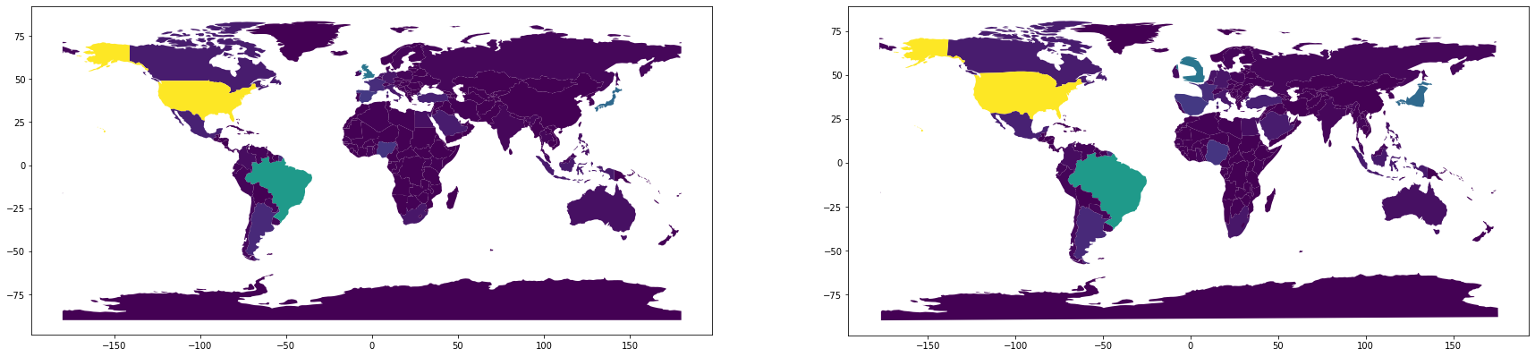
To begin with we will plot all the tweets collected between 23:00:00 and 23:59:59 (GMT) on December 31rst. On the left side a world map with colors indicating number of tweets is shown, and on the right side a cartogram. It seems the United kingdom is tweeting a lot at this moment, which makes sense as they are about to enter 2021. Happy new year!
df = pd.read_csv(pre_proc_path)
df = df.query("(day==31) and (hour==23)")
# Group by country code
df_cc = country_code_grouping(df)
df_cc = add_iso_a3_col(df_cc)
df_cc = df_cc[["iso_a3", "count"]] #reorder to have iso_a3 as first column (required in order to use the map view in display). Also we don't need countryCode and index columns.
# Create the geopandas dataframe
df_world = create_geo_df(df_cc)


#fig, axes = plt.subplots(nrows=1, ncols=2, figsize=(30,15))

# Make a choropleth plot
# df_world.plot(column='numTweets', cmap='viridis', ax=axes[0])

# The make_cartogram function can not handle a tweetcount of zero, so a not so elegant solution is to clip the tweet count at 1.
# The alternative (to remove countries without tweets) is not elegant either (and causes problems when we look at the time evolution, since countries will be popping in and out of existence).
df_world["numTweets"] = df_world["numTweets"].clip(1, max(df_world["numTweets"]))

df_cartogram = make_cartogram(df_world, 'numTweets', 5, inplace=False)
# df_cartogram.plot(column='numTweets', cmap='viridis', ax=axes[1])


# plt.show()
/local_disk0/.ephemeral_nfs/envs/pythonEnv-318e9509-84da-4944-ac59-77216123051e/lib/python3.7/site-packages/cartogram_geopandas.py:48: UserWarning: Geometry is in a geographic CRS. Results from 'area' are likely incorrect. Use 'GeoSeries.to_crs()' to re-project geometries to a projected CRS before this operation.

  return crtgm.make()
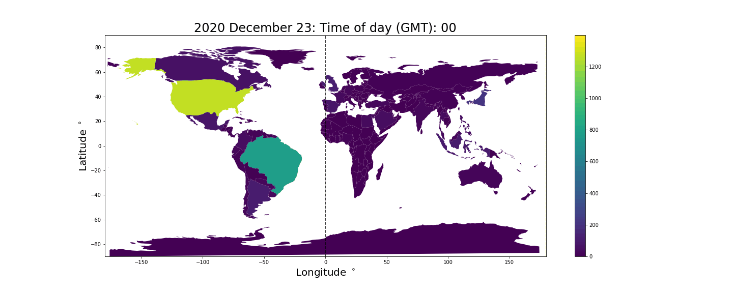
Animating the time evolution of tweets
Rather than looking at a snapshot of the worlds twitter activity it would be interesting to look at how twitter activity looks across hours and days.
The following cell generates a number of png cartograms. One for every hour between December 23rd 2020 and January 2nd 2021.
It takes quite long to generate them all (around eight minutes) so you might want to just load the pregenerated pngs in the cell below.
NOTE: Geopandas prints some warnings related to using unprojected geometries (We work in longitude and latitude rather than some standard 2D map projection). This is not an issue since we are not using the area function.
pre_proc_path = "/dbfs/datasets/ScaDaMaLe/twitter/student-project-10_group-Geosmus/tmp/processedDF.csv"
df = pd.read_csv(pre_proc_path)
key = "hour"
timeOfDayList = list(range(0, 24))
nIter = 5
cartogram_key = "numTweets"
for day in range(23,32):
  out_path = "/dbfs/FileStore/group10/cartogram/2020_Dec_%d_hour_"%day
  legend = "2020 December %d: "%day
  animate_cartogram(df.query("(day==%d) and (year==2020)"%day), key, timeOfDayList, out_path, nIter, cartogram_key, legend)
for day in range(1,2):
  out_path = "/dbfs/FileStore/group10/cartogram/2021_Jan_%d_hour_"%day
  legend = "2021 January %d: "%day
  animate_cartogram(df.query("(day==%d) and (year==2021)"%day), key, timeOfDayList, out_path, nIter, cartogram_key, legend)
Now that we have generated the PNGs we can go ahead and combine them into a gif using the python imageIO library.
images=[] # array for storing the png frames for the gif
timeOfDayList = list(range(0, 24))
#Append images to image list
for day in range(23,32):
  for hour in timeOfDayList:
    out_path = "/dbfs/FileStore/group10/cartogram/2020_Dec_%d_hour_%d.png"%(day, hour)
    images.append(imageio.imread(out_path))
for day in range(1,2):
  for hour in timeOfDayList:
    out_path = "/dbfs/FileStore/group10/cartogram/2021_Jan_%d_hour_%d.png"%(day, hour)
    images.append(imageio.imread(out_path))
#create gif from the image list
imageio.mimsave("/dbfs/FileStore/group10/cartogram/many_days_cartogram.gif", images, duration=0.2)
The result is the following animation. The black vertical bar indicates where in the world it is midnight, the yellow vertical bar indicates where it is noon, and the time shown at the top is the current GMT time. The color/z-axis denotes the number of tweets produced in the given hour. Unsurprisingly we see countries inflate during the daytime and deflate close to midnight when people tend to sleep.
Sentiment mapping
This cartogram animation expresses the amount of tweets both through the size distortions and the z-axis (the color). In a way it is a bit redundant to illustrate the same things in two ways. The plot would be more informative if instead the z-axis is used to express some measure of sentiment.
We will load a dataframe containing sentiment cluster information extracted in the previous notebook. This dataframe only contains tweets which contained "Unicode block Emoticons", which is about 14% of the tweets we collected between December 23rd and January 1rst. The dataframe has boolean columns indicating if an emoji from a certain cluster is present. We will use the happy and not happy clusters found in the previous notebooks to express a single sentiment score:
df["sentiment"] = (1 + df["happy"] - df["notHappy"])/2 This is useful since it allows us to make a map containing information about both clusters. A caveat is that the although these clusters mostly contain what we would consider happy and unhappy emojis respectively, they do also contain some rather ambivalent emojis. The unhappy cluster for example contains a smiley that is both smiling and crying. On top of this emojis can take on different meanings in different contexts. Expressed in this way we get that: * A sentiment value of 0 means that the tweet contains unhappy emojis and no happy emojis. * A sentiment value of 0.5 means that the tweet either contain both happy and unhappy emojis or that it contains neither happy or unhappy emojis. * A sentiment value of 1 means that the tweet did not contain unhappy emojis but did contain happy emojis.
The pie chart below reveals that unhappy tweets are significantly more common than happy ones.
path = "/datasets/ScaDaMaLe/twitter/student-project-10_group-Geosmus/processedEmoticonClusterParquets/emoticonCluster.parquet"
cluster_names = ["all", "happy", "notHappy", "cat", "monkey", "SK", "prayer"]
df = load_twitter_geo_data_sentiment(path)
df = df[(df['day'] != 22) & (df['day'] != 2 )] #Data collection was continuous during the 22nd December whereas for the remaining days we only streamed for 3 minutes per hour. Data collection ended in the middle of Jan second so to only have full day we disregard Jan 2.

# Let's try combining the happy and sad columns to one "sentiment" column.
df["sentiment"] = (1 + df["happy"] - df["notHappy"])/2

display(df[["happy", "notHappy", "sentiment"]])

Next we will look at a choropleth world map using the "sentiment" score as z-axis. Countries with fewer than 100 tweets are not shown here.
It looks like the tweets from Africa, The US and the middle east are less happy than those from latin America, Europe, Asia and Oceania.
df_cc = country_code_grouping_sentiment(df)
df_cc = add_iso_a3_col(df_cc)
df_cc = df_cc[["iso_a3", "count", "sentiment"]] #reorder to have iso_a3 as first column (required in order to use the map view in display). Also we don't need countryCode and index columns.
df_cc
# Create the geopandas dataframe
df_world = create_geo_df_sentiment(df_cc)

vmin = min(df_world.query("numTweets>=20")["sentiment"])
vmax = max(df_world.query("numTweets>=20")["sentiment"])
cmap = matplotlib.colors.LinearSegmentedColormap.from_list("", ["red","yellow","green"])
cmap.set_under(color='gray', alpha=0.5)

#We filter out countries with very few emojii tweets
df_world.loc[df_world["numTweets"] < 100, 'sentiment'] = vmin -1
# df_world = df_world.query("numTweets>10").reset_index()

# Make a choropleth plot
# df_world.plot(column='sentiment', cmap=cmap, legend=True, vmin=vmin, vmax=vmax, figsize=(20,8))
# plt.title("Sentiment by country", fontsize=24)
# plt.xlabel("Longitude $^\circ$", fontsize=20)
# plt.ylabel("Latitude $^\circ$", fontsize=20)
# plt.show()
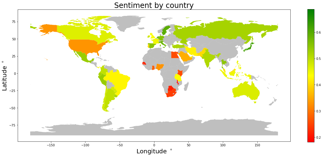
Let us have a look at how this sentiment score ranks the countries (with more than 100 emoji tweets) from happiest to unhappiest.
Japan, Sweden and Netherlands are in the lead.
display(df_world.query("numTweets>=100").sort_values("sentiment", ascending=False)[["name", "continent", "numTweets", "sentiment"]])
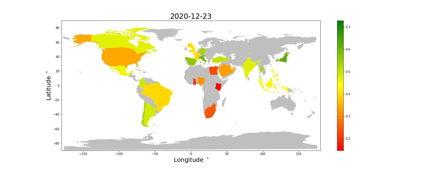
We are now ready to generate an animated cartogram using the number of tweets to determine the area distortions and using the sentiment score as the color dimension.
We do not have as many emoji tweets, so here we limit ourselves to only one frame per day. We color countries with less than 30 tweets per day grey, since their sentiment score will be extremely unreliable.
The following cell generates the animation, but as we already have produced it you can skip straight to the next cell where it is displayed.
#Load data
path = "/datasets/ScaDaMaLe/twitter/student-project-10_group-Geosmus/processedEmoticonClusterParquets/emoticonCluster.parquet"
cluster_names = ["all", "happy", "notHappy", "cat", "monkey", "SK", "prayer"]
df = load_twitter_geo_data_sentiment(path)
df = df[(df['day'] != 22) & (df['day'] != 2 )] #Data collection was continuous during the 22nd December whereas for the remaining days we only streamed for 3 minutes per hour. Data collection ended in the middle of Jan second so to only have full day we disregard Jan 2.

# Combine the happy and sad columns into one "sentiment" column.
df["sentiment"] = (1 + df["happy"] - df["notHappy"])/2

# Arguments for the function animate_cartogram_sentiment(...)
legendList = ["2020-12-23", "2020-12-24", "2020-12-25", "2020-12-26", "2020-12-27", "2020-12-28", "2020-12-29", "2020-12-30", "2020-12-31", "2021-01-01"]
key = "day"
nIter = 5
minSamples = 30
cartogram_key = "numTweets"
dayList = [23, 24, 25, 26, 27, 28, 29, 30, 31, 1]
cmap = matplotlib.colors.LinearSegmentedColormap.from_list("", ["red","yellow","green"])
cmap.set_under(color='gray', alpha=0.5)
cmap.set_bad(color='gray', alpha=0.5)

# Find upper and lower range for the color dimension.
# We want to utilize the full dynamic range of the z-axis.
vmin = 0.45
vmax = 0.55
for day in dayList:
  df_filtered = df.query("day==%d"%day).reset_index()
  df_cc = country_code_grouping_sentiment(df_filtered)
  df_cc = df_cc.query("count>%d"%minSamples)
  lower = min(df_cc["sentiment"])
  upper = max(df_cc["sentiment"])
  if lower<vmin:
    vmin = lower
  if upper>vmax:
    vmax = upper

out_path = "/dbfs/FileStore/group10/cartogram/sentiment"
animate_cartogram_sentiment(df.reset_index(), key, dayList, out_path, nIter, cartogram_key, minSamples, cmap, vmin, vmax, legendList)
Unfortunately we do not have enough data to color all the countries, but some interesting things can still be observed. * Most countries tweet happier at Christmas and New Years. Take a look at Spain and Brazil for example. * Japan and most of Europe looks consistently happy, while Africa, Saudi Arabia and the US looks unhappy. * The UK looks comparatively less happy than the rest of Europe.
We keep in mind that these differences may be caused by or exaggerated by differences in how emojis are used differently in different countries.
Looking at trends in emoticon use over times of the day
Next we aggregate all of the tweet data into one set of 24 hours, i.e. we merge all the days into one to try to see trends in emoticon use depending on time of day.
We want to visualize the different clusters in cartogram animations. First we filter the tweets by cluster so that we get a dataframe per cluster containing only the tweets wherein there is an emoticon from that cluster. In the cartograms we scale each country by how large a proportion of the total tweets from that country pertaining to that cluster are tweeted in a given hour. So if the area (in the current projection...) of a particular country is \(A\), then its "mass" (recall that these plots aim for equal "density") at hour \(h\) in these plots will be \[A + \sigma p_h A,\] where \(p_h\) is the proportion of tweets in that country and cluster that is tweeted at hour \(h\) and \(\sigma\) is a scaling factor which we set to 2. In order to reduce noise, all countries which have fewer than 100 tweets of a given cluster are set to have constant "mass" corresponding to their area.
path = "/datasets/ScaDaMaLe/twitter/student-project-10_group-Geosmus/processedEmoticonClusterParquets/emoticonCluster.parquet"
cluster_names = ["all", "happy", "notHappy", "cat", "monkey", "SK", "prayer"]
# # This cell might take 15-20 minutes to run

# for cluster_name in cluster_names:
#    if cluster_name == "all":
#      df = load_twitter_geo_data(path)
#    else:
#      df = load_twitter_geo_data_with_filter(path, cluster_name)

#    df = df[df['day'] != 22].reset_index() #Data collection was continuous during the 22nd December whereas for the remaining days we only streamed for 3 minutes per hour.
#    df = df[(df['day'] != 22) & (df['day'] != 2 )].reset_index() #Data collection was continuous during the 22nd December whereas for the remaining days we only streamed for 3 minutes per hour. Data collection ended in the middle of Jan second so to only have full day we disregard Jan 2.

#    # add column in order to be able to display ratio of total tweets
#    df['numTweets'] = df.groupby('countryCode')['countryCode'].transform('count')
#    df["proportion"] = 1 / df["numTweets"]

#    # filter out countries with very few tweets
#    df = df[df.numTweets >= 100]
#    # create cartogram
#    key = "hour"
#    timeOfDayList = list(range(0, 24))
#    out_path = "/dbfs/FileStore/group10/cartogram_" + cluster_name
#    nIter = 30
#    cartogram_key = "proportion"

#    animate_cartogram_extra(df[["index", "countryCode", "proportion", "hour"]], key, timeOfDayList, out_path, nIter, cartogram_key, default_value=0, scale_factor=3, vmin=0.0, vmax=0.15)
Below are the obtained plots for emoticon use by time of day in the different countries. The colorbar corresponds to the proportion of tweets from a country tweeted in a given hour and the areas are scaled as described above. The black line is again midnight and the yellow line noon.
For some of the clusters, for instance "cat" and "monkey", it is clear that we have too little data to be able to say anything interesting. Perhaps the one conclusion one can draw there is that the monkey emoticons are not used very often in the US or Japan (since those countries tweet a lot but did not have more than 100 total tweets with monkey emoticons).
The other plots mostly show that people tweet more during the day than at night. Perhaps the amount of emoticons in each of the "happy" and "notHappy" clusters is too large to be able to find some distinctiveness in the time of day that people use them.
The most interesting cluster to look at in this way might be the prayer cluster where it appears that we can see glimpses of the regular prayers in countries such Egypt and Saudi Arabia.
clusters_to_plot = ["happy", "notHappy", "SK", "cat", "monkey", "prayer"]
html_str = "\n".join([f"""
  <figure>
  <img src="/files/group10/cartogram_{cluster_name}.gif" style="width:60%">
  <figcaption>The "{cluster_name}" cluster.</figcaption>
  </figure>
  <hr style="height:3px;border:none;color:#333;background-color:#333;" />
  """ for cluster_name in clusters_to_plot])

displayHTML(html_str)